v5


Credits
['kangrui', 'lookang', 'enqi']
v4 localise the library

Credits
['kangrui', 'lookang', 'enqi']
Credits
['kangrui', 'lookang', 'enqi']

Credits
['kangrui', 'lookang', 'enqi']
Credits
['kangrui', 'lookang', 'enqi']
Sample Learning Goals
[text]
For Teachers
Web EJS makes learning geography more engaging by allowing students to explore data interactively. Web EJS allows teachers and students to explore various social, economic, and environmental datasets, helping them better understand trends over time. It gives them the ability to visualize complex data, compare different countries, and make sense of changes over long periods. Let’s dive into an interactive simulation that shows the progress of urbanization, carbon emissions, GDP per capita, infant mortality, and life expectancy in Southeast Asia and beyond. By examining these key indicators, students can develop a deeper understanding of how countries develop and the challenges they face.
Urbanization Trends
 |
| link https://sg.iwant2study.org/ospsg/index.php/1262 |
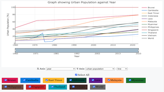
The first interactive graph shows the percentage of people living in urban areas over the years for different countries. From the data, we can see that countries like Brunei and Singapore have the highest levels of urbanization, with over 70% of people living in cities. This high level of urbanization is often linked to greater economic development, better infrastructure, such as roads and public transit, and more job opportunities in urban areas, like positions in services and industries. In contrast, countries like East Timor have a slower increase in urban population, showing that they are at a different stage of urban development. This slower rate of urbanization may be due to economic, cultural, or infrastructural factors that affect people's ability or willingness to move to cities. With the interactive graph, users can focus on specific countries and compare them, which helps in understanding how regional development differs. It also provides an opportunity to discuss the benefits and challenges of urbanization, such as improved access to services versus the potential for overcrowding and increased pollution.
Carbon Emissions and Sustainability
 |
| link https://sg.iwant2study.org/ospsg/index.php/1262 |
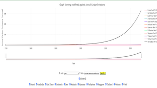
Another key graph shows the annual carbon emissions for each country. This graph helps us see the effect of industrialization on carbon emissions over time. The graph shows that global carbon emissions have increased significantly since the 1950s, which lines up with rapid industrial growth in many countries. This period, often referred to as the post-war economic boom, saw many countries investing heavily in manufacturing and infrastructure, leading to increased carbon emissions. Countries like Indonesia and Vietnam have shown rising emissions in recent decades, highlighting the challenge of balancing economic growth with protecting the environment. Both countries have started initiatives to reduce emissions, such as investing in renewable energy projects and setting targets for reducing deforestation. These countries are trying to improve their economies, but this often comes with increased use of fossil fuels and higher emissions. The interactive features make it easier for students to understand how emissions have changed over time and which countries contribute the most to global carbon emissions. By interacting with the data, students can explore questions like: Which countries have the highest emissions per capita? How do emissions in developing countries compare to those in developed countries? This kind of exploration helps students understand the complexities of sustainability and the different responsibilities that countries have when it comes to addressing climate change.
Socioeconomic Indicators
 |
| link https://sg.iwant2study.org/ospsg/index.php/1262 |
The simulation also includes a graph that shows GDP per capita over time. GDP per capita is a measure of a country's economic output per person and is often used as an indicator of living standards. It is clear that countries like Singapore and Brunei have a much higher GDP per person compared to their neighbors, which reflects their economic growth and policies. Singapore, for example, has invested heavily in technology, education, and infrastructure, which has helped it become one of the wealthiest nations in the region. In contrast, other countries in the region are still developing their economies and have lower GDP per capita. This data is important for understanding the differences in wealth and economic opportunities between different countries. By comparing GDP per capita, students can discuss why some countries have higher living standards than others and what factors contribute to economic growth. The interactive graph shows how GDP per capita has changed over time. This can lead to discussions about economic policies, globalization, and the impact of technological advancements on different countries.
Infant Mortality and Life Expectancy
 |
| link https://sg.iwant2study.org/ospsg/index.php/1262 |
Two important indicators of health are the infant mortality rate and life expectancy.
 |
| link https://sg.iwant2study.org/ospsg/index.php/1262 |
The visualizations show a drop in infant mortality across Southeast Asia, which means healthcare and living conditions have improved. Infant mortality is often used as an indicator of the overall health of a country because it reflects the quality of healthcare, nutrition, and living conditions. A decline in infant mortality suggests that more children are surviving their early years, which is a sign of progress. On the other hand, life expectancy has increased, especially after the mid-20th century, showing progress in healthcare, nutrition, and economic conditions. Life expectancy is an important measure because it indicates how long people are expected to live on average and reflects the overall quality of life. The interactive graphs allow students to explore how these health indicators have changed over time and what factors might have contributed to these changes. For example, improvements in medical technology, vaccination programs, better sanitation, and increased access to healthcare all play a role in improving health outcomes. By exploring these trends, students can gain a better understanding of the connections between economic development, healthcare, and quality of life.
Making Learning Engaging with Interactivity
These graphs are powerful tools for understanding long-term changes and comparing trends between countries, especially in a geography class. By letting students choose which data sets to look at, they can better understand both local and global contexts. For example, students might find it insightful to examine data on carbon emissions alongside GDP per capita to understand the relationship between economic development and environmental impact. Using Web EJS for these interactive graphs makes learning more interesting and helps students understand abstract numbers and trends more easily. For example, instead of just reading that urbanization has increased in a country, students can see the data for themselves, compare it to other countries, and think about why these changes are happening. This kind of interactive learning encourages critical thinking and allows students to ask questions and find answers through exploration. It also helps them develop data literacy skills, which are increasingly important in today's world. Understanding how to read, interpret, and analyze data is a valuable skill that will benefit students in many areas of study and in their future careers.
Technology in Geography Education
Using tools like Web EJS in geography lessons can make learning more dynamic and effective. These interactive graphs help students understand the material better by letting them directly interact with the data, instead of just looking at static graphs. This hands-on experience makes learning more engaging and helps students gain better insights. For example, students can use the interactive graphs to compare different countries, see how indicators have changed over time, and draw their own conclusions. This kind of learning is much more engaging than simply listening to a lecture or reading a textbook. It also allows students to learn at their own pace, as they can spend more time exploring the data that interests them the most. By using technology like Web EJS, teachers can create a more interactive classroom environment where students are actively involved in their learning. This approach not only helps students understand the material better but also makes learning more enjoyable and meaningful.
Overall, Web EJS is leading the way to more interactive, data-driven learning experiences, allowing students to explore geography in new and meaningful ways. By examining different social, economic, and environmental metrics through easy-to-use interactive graphs, students get a deeper understanding of the factors that shape our world. This kind of learning goes beyond memorizing facts—it encourages students to think critically, make connections between different pieces of information, and understand the bigger picture. As technology continues to play a larger role in education, tools like Web EJS will be essential for helping students engage with complex topics and develop the skills they need to succeed in a rapidly changing world.
Research
[text]
Video
[text]
Version:
Other Resources
[text]
end faq
{accordionfaq faqid=accordion4 faqclass="lightnessfaq defaulticon headerbackground headerborder contentbackground contentborder round5"}